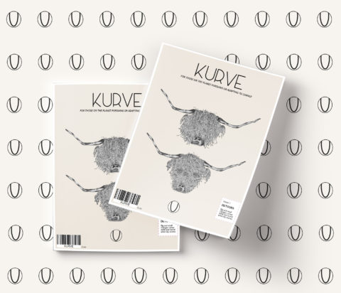
Finding a new concept
A study project brief set by carolseatory.co.uk on the Strohacker Design Course. To create a new editorial/magazine concept and brand.
In an age of constant flux Kurve brings you stories about anyone who may be pursuing or adapting to change.
The name Kurve was selected as it best represented change. The definition of ‘Curve’ means; to turn away from a course – the trace of a point whose direction or motion changes. The typography uses curves combined with straight lines to express the curve changing course. The pure simplistic logo design represents the modest character of Kurve and is taken from mathematical curve drawings.
The first edition Detours devotes itself to stories about career shifts. An an article ‘time is an elastic property’ is about three successful writers and artists reaching success at over 70 years old. This is juxtaposed with world adversity stories like adapting to floods in Bangladesh and preserving the amazon because not everyone is able to change career, some people may not have the luxury of pursuing change but are having to adapt to it.
Kurve thinks about everyone and is there to support and help people through change. Kurve is there to positively reassure people that we’re all in this together.

