
Nourish, Balance, Thrive
Project Ownership: end-to-end creative lead
Brief: promote and increase attendance
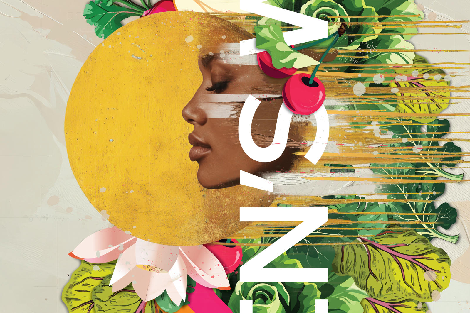
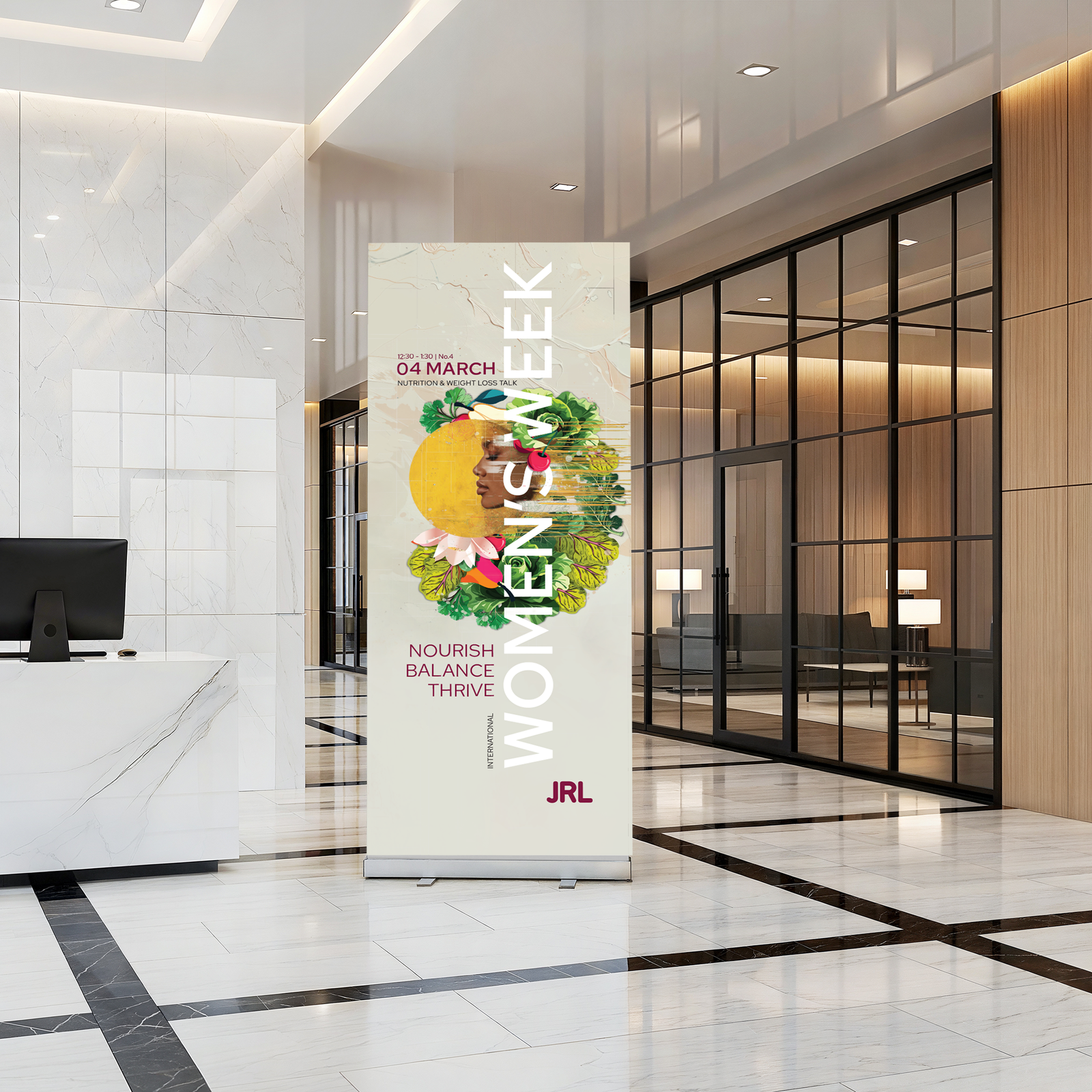
Creative Direction: use recognised feminine
visual language to connect with the female
audience, including a natural but vibrant colour
palette. Flora and Fauna for ‘Nourish’, balanced
typography, composition and layout (including
use of the golden ratio) for ‘Balance’, use of
textured, spontaneous painterly graphics to
evoke ‘Thrive’.
Scope: creative strategy, research, audience
insight, campaign concept, creative direction,
copywriting, visual identity, graphic design,
artwork for print and digital, print production.
Hit 10 Take 1
Project Ownership: end-to-end creative lead
Brief: increase attendance at on-site gym facilities
and classes by promoting an opportunity to gain
paid annual leave holidays with a ‘hit 10 classes
a month and get 1 day off work’
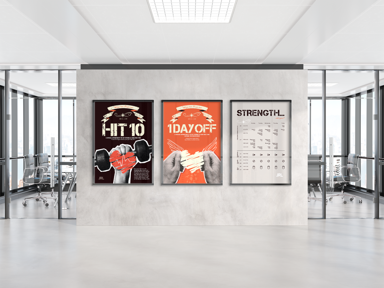
Direction: HIT 10, 1 OFF
A sketched heart symbol as both a reference
to health and to the freedom of a day off,
including a universal freedom symbol of a ‘wing’.
Using hipster styling and emotive strap lines;
‘work your heart, free your heart’, ‘explore
the unexplored’, ‘a special opportunity to get
strong and earn free time’.
Scope: creative strategy, research, audience insight,
campaign concept, creative direction,
copywriting, visual identity, graphic design,
artwork for print and digital, print production.