Bright branding: casting a spell on design
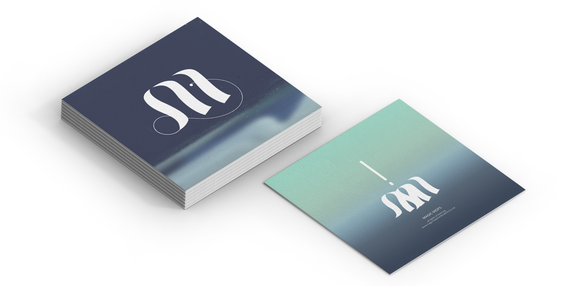
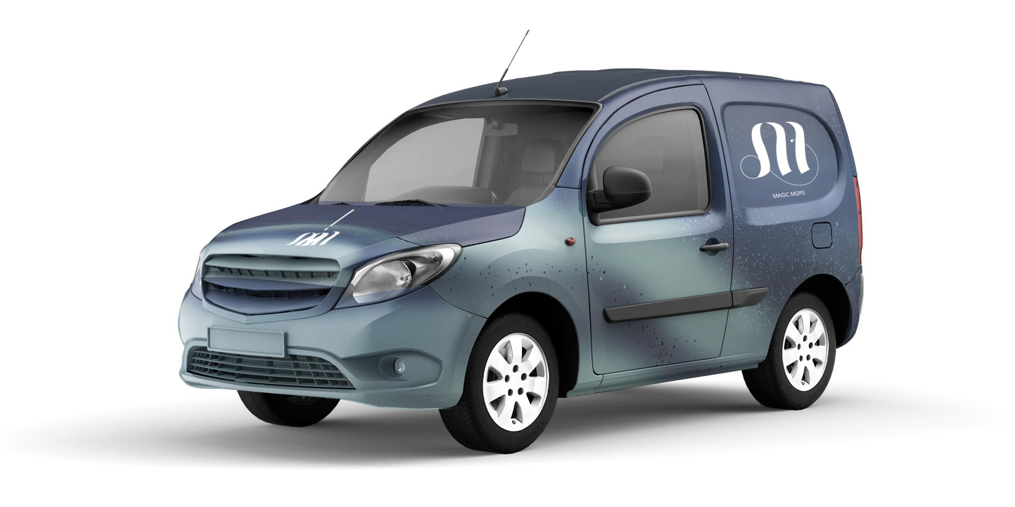
Branding for a cleaning business that evokes a playful old fashioned magic whilst also remaining professional and trustworthy.
Hannah was really easy to work with, completely understood my requirements & produced fantastic branding that I feel really gives my company the professional look & feel I was after. Thank you. Team@MM: magicmopshertfordshire.co.uk
INSIGHT
I designed a modern and classic letter ‘M’ design with influence from the movement and elements of a mop. This ‘M’ was also designed so that it could duplicate and overlap to create a mop illustration. I used a classic/professional dark blue with a ‘spell’ green to represent magic. The colour combination and gradient/swirl effect also represents magic cleaning water.


